Webflow Website Design Best Practices

Modern websites are expected to do far more than simply look attractive. Today’s websites must combine responsive UX, SEO-friendly structure, conversion-focused layouts, fast performance, and scalable content systems to compete effectively online.
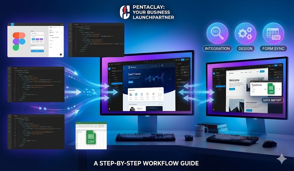
Platforms like Webflow Templates have made it significantly easier for startups, agencies, SaaS companies, and creators to build professional websites with responsive layouts, scalable CMS systems, and advanced visual customization.
However, using Webflow alone does not guarantee effective website design.
Poor website structure can still lead to:
weak SEO performance
poor user experience
low conversion rates
confusing navigation
mobile usability issues
This is why understanding Webflow website design best practices is essential.
By applying modern design principles, UX-focused layouts, and SEO-friendly website structure, businesses can create websites that improve:
authority positioning
lead generation
onboarding
search visibility
user engagement
Whether you are building:
this guide will help you create modern Webflow websites optimized for scalability, responsive UX, and long-term SEO growth.
You can also explore:
Why Webflow Has Become Popular for Website Design
Webflow has become one of the most widely used website platforms because it combines:
responsive visual editing
scalable CMS systems
flexible layouts
SEO-friendly architecture
advanced animations
professional design control
Unlike traditional website builders, Webflow allows businesses and designers to build highly customized websites without relying heavily on complex coding workflows.
Modern companies use Webflow because it helps:
reduce development time
improve launch speed
create responsive UX
scale content marketing
strengthen digital branding
This is especially important for:
startups
SaaS businesses
digital agencies
creators
service companies
Explore:
Modern Web Design Principles
Successful websites follow design principles that improve:
readability
usability
navigation
conversion optimization
visual clarity
These principles create the foundation of effective website design.
Minimalism
Minimalist design focuses on clarity and simplicity rather than visual overload.
Modern minimalist websites often include:
clean layouts
balanced spacing
limited color palettes
concise messaging
focused CTA systems
Minimalism helps users focus on the most important content while improving readability and browsing experience.
Modern:
often prioritize minimalist onboarding-focused design systems because they improve product clarity and user engagement.
Visual Hierarchy
Visual hierarchy determines how users scan and understand content.
Effective hierarchy uses:
typography size
spacing
color contrast
layout positioning
Important elements should stand out clearly:
headlines
CTA buttons
onboarding sections
pricing systems
testimonials
Strong hierarchy improves:
usability
onboarding UX
content readability
conversions
This principle is heavily used in:
Readability
Even visually attractive websites fail if users struggle to read the content.
Readability depends on:
typography
paragraph structure
line spacing
visual contrast
section hierarchy
Modern websites should avoid:
large text blocks
cluttered layouts
inconsistent spacing
Structured content improves:
engagement
scanning behavior
SEO readability
user retention
Learn more:
UX Best Practices for Webflow Websites
User experience (UX) focuses on how visitors interact with a website.
Good UX helps users:
navigate smoothly
find information quickly
complete actions easily
Clear Navigation Structure
Navigation systems should remain:
simple
intuitive
consistent
Most high-performing websites organize navigation around:
Home
Services
Features
Pricing
Blog
Contact
Complicated menus increase friction and reduce usability.
Most:
prioritize simplified navigation systems.
User Flows
User flows describe how visitors move through the website.
Example:
Homepage → Services → Contact Page
Well-designed user flows improve:
conversions
onboarding
lead generation
content discoverability
Conversion-focused:
often use structured onboarding flows.
Usability
Usability focuses on making websites easy to interact with.
Key usability considerations include:
clear CTA buttons
intuitive layouts
accessible design
responsive interactions
mobile optimization
Good usability improves:
engagement
conversions
trust
retention
Conversion-Focused Website Layouts
Modern websites should support business goals rather than simply displaying information.
Conversion-focused layouts help businesses:
generate leads
improve onboarding
increase inquiries
improve sales
Strategic CTA Placement
Call-to-action buttons encourage users to take action.
Examples:
Get Started
Request a Demo
Contact Us
Explore Templates
CTA buttons should appear strategically throughout:
hero sections
feature sections
pricing sections
footer areas
Many:
prioritize CTA hierarchy heavily because onboarding and conversion optimization are essential.
Landing Page Structure
Effective landing pages often follow this structure:
Hero section
Feature explanations
Testimonials
Pricing systems
CTA sections
This structure guides users through a logical decision-making process.
Businesses requiring scalable onboarding systems should explore:
Social Proof Systems
Social proof strengthens credibility and trust.
Examples:
testimonials
reviews
client logos
case studies
usage statistics
Trust signals improve:
onboarding
conversions
authority positioning
Many:
use social proof heavily.
Animation Best Practices in Webflow
Webflow’s animation system allows businesses to create:
interactive layouts
motion effects
onboarding animations
micro-interactions
When used correctly, animations improve:
engagement
storytelling
UX polish
onboarding clarity
Micro-Interactions
Micro-interactions include:
button hover effects
icon animations
navigation highlights
responsive transitions
These subtle details improve polish and interactivity.
Scroll Animations
Scroll-based animations reveal content progressively.
Examples:
fade-in sections
slide transitions
feature reveals
storytelling interactions
These effects are common in:
Performance Considerations
Excessive animations can:
slow loading speed
reduce usability
damage mobile performance
Modern websites should prioritize:
smooth transitions
fast performance
purposeful motion systems
Fast-loading websites improve:
SEO
conversions
user retention
Learn more:
Mobile Optimization Best Practices
Mobile traffic now dominates global web usage.
Modern Webflow websites must prioritize:
mobile responsiveness
touch-friendly UX
fast mobile loading
readable typography
Responsive Layouts
Responsive design ensures layouts adapt across:
desktops
tablets
smartphones
Webflow simplifies responsive design through visual breakpoints and layout customization tools.
Businesses focused on scalable SEO should combine responsive design with:
CMS systems
fast performance
mobile-first UX
Explore:
Touch-Friendly Design
Mobile users interact using touch rather than cursor navigation.
Touch-friendly UX includes:
large buttons
proper spacing
simple navigation
accessible layouts
This improves:
usability
engagement
conversion rates
Frequently Asked Questions
Is Webflow good for website design?
Yes. Webflow provides responsive layouts, flexible customization, scalable CMS systems, and SEO-friendly architecture ideal for modern website design.
Do I need coding knowledge to use Webflow?
Basic websites can be built visually, although HTML and CSS knowledge may improve advanced customization workflows.
Are Webflow websites SEO-friendly?
Yes. Properly structured Webflow websites can perform very well in search engines when combined with:
semantic structure
responsive UX
scalable CMS systems
optimized performance
Explore:
Should websites be designed mobile-first?
Yes. Mobile-first UX is essential because most users browse websites using smartphones and tablets.
Effective website design requires more than attractive visuals.
Successful Webflow websites combine:
responsive UX
SEO-focused architecture
conversion-focused layouts
scalable CMS systems
mobile optimization
modern onboarding systems
By following these Webflow website design best practices, businesses can create websites that:
improve usability
strengthen branding
increase conversions
improve SEO performance
scale long-term
Whether you are building:
Webflow provides the flexibility and scalability needed to create modern high-performing websites.
Explore more: